

UI/UX.
Practical writing on brand, growth and technology — and on the connections between them, which is where most of the value hides. No trend-chasing, no filler; frameworks and honest trade-offs, written by the team that does the work.

How Many Fields Should a Contact Form Have?
Two fields will get you a reply. Everything after that has to argue for itself, survive an honest required flag, and fail gracefully when somebody gets it wrong.
Read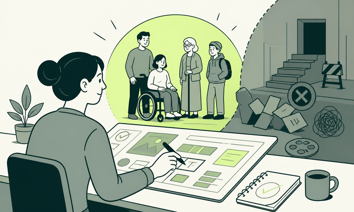
Accessibility as a Default: What to Build Before the Audit
Accessibility retrofits are expensive because they change structure, not styling. Decide semantics, focus, contrast, target size and motion at build time and the audit becomes a check rather than a rescue.
Read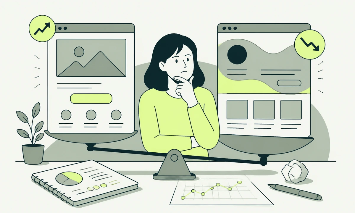
Why Does Your Redesign Convert Worse Than the Page It Replaced?
A redesign that converts worse almost always removed something. Find the missing content, the renamed labels, the extra weight and the unfamiliar controls before anyone argues about taste.
Read
Design Systems: When Do You Actually Need One?
Design system adoption is a threshold decision, not a maturity badge. Count your surfaces, your contributors and your rate of change before you build anything reusable.
Read
What Does a Keyboard User Experience on Your Site Right Now?
Keyboard accessibility is not an audit line item. It is what happens when you put the mouse down and press Tab: whether focus is visible, ordered, escapable, and able to reach everything.
Read
Empty States Are the Most Neglected Screen in Your Product
Empty is the first screen a new user ever sees. An empty state has four jobs, and the blank panel with a grey icon and one cheerful line does none of them.
Read
Mobile First Is Not a Layout Decision
Stacking columns is the easy part. Mobile first design is a decision about what content earns the screen, which targets a thumb can hit, and which desktop habits quietly follow you down.
Read
Where Does a Floating Chat Widget Fail a Screen Reader?
Automated scans happily pass a chat widget that nobody can use without a mouse. The failures sit in focus, announcements, dismissal and reading order, and every one of them is fixable before launch.
Read
Research That Could Have Changed the Plan, or It Was Ceremony
Name the finding that would change the plan before you commission the study. If no finding would, you are buying ceremony, and the money is better spent measuring what people actually do.
Read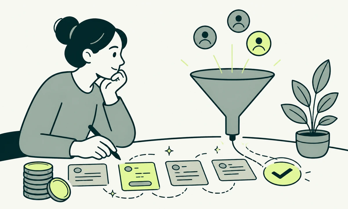
Microcopy: The Cheapest Conversion Work Available
Rewriting a button, a label, an error and an empty state costs an afternoon and moves more than a redesign does. Here is what to change, why each rewrite works, and where microcopy cannot save you.
Read
Should You Test With Five Users or Ship and Measure?
Usability testing tells you why something breaks. Analytics tells you how many people it breaks for. Neither substitutes for the other, and the order you run them in decides how much work you waste.
Read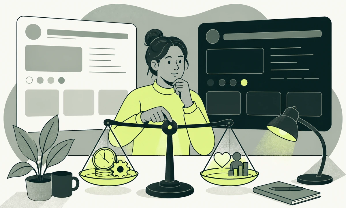
Dark Mode: What It Costs and When It Is Worth It
Dark mode design is not a switch. It is a second set of tokens, a second contrast audit, a second image treatment and a second QA pass, and some sites should not take it on.
Read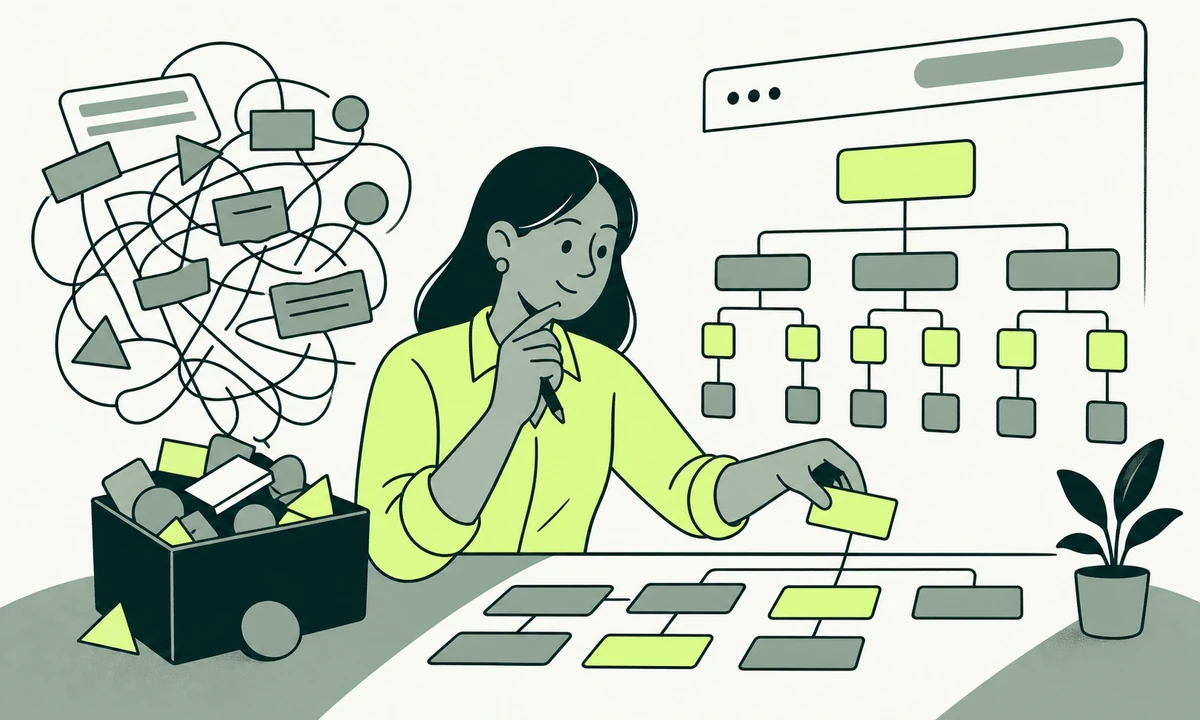
Navigation for a Site That Has Outgrown Its Menu
A menu is not a site structure. When the nav stops fitting, the fix is rarely another dropdown: it is deciding what the site is made of, then letting the menu show only the top of it.
Read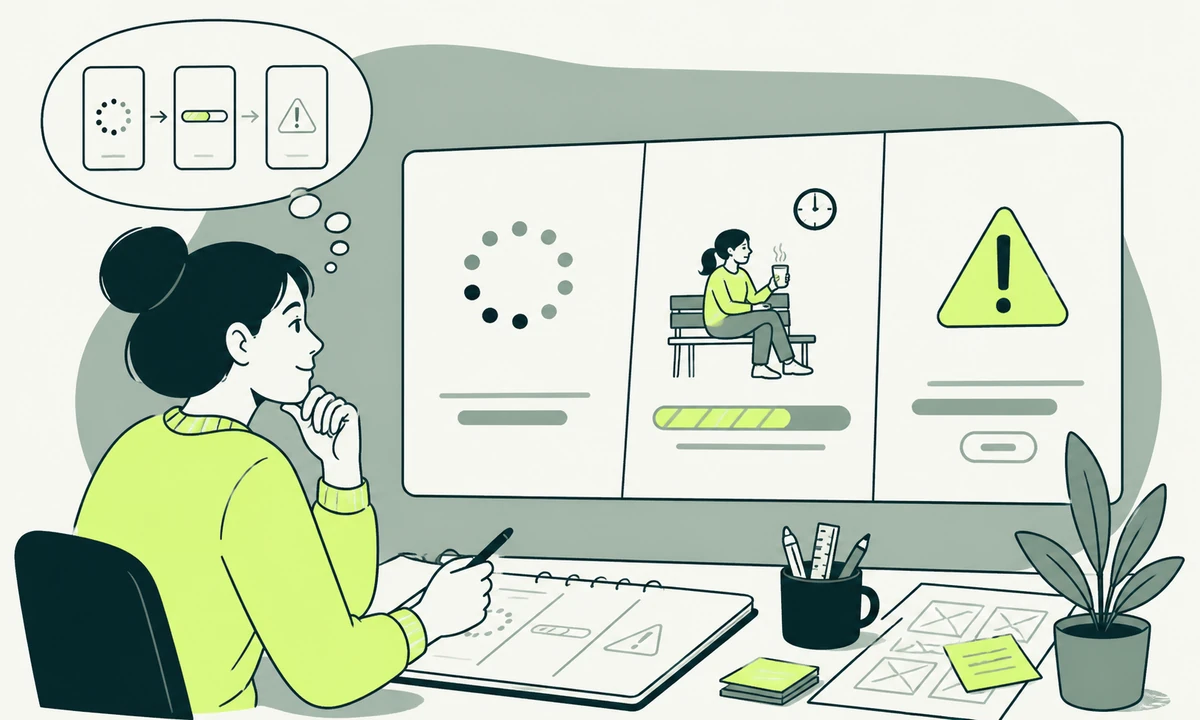
Loading, Waiting, Failing: Designing the States Nobody Mocks Up
People judge quality in the seconds when nothing has arrived yet. Loading and error states are design decisions rather than engineering leftovers, and they are the screens nobody bothers to mock up.
Read
How Do You Prove a Design Change Worked?
Most design changes are declared successful by whoever shipped them. A baseline taken beforehand, one metric named in advance and two guardrails turn that into something you can defend.
Read15 articles in UI/UX.
Rather talk it through
than read about it?
Every engagement starts with a conversation about where your business is going.