

Navigation for a Site That Has Outgrown Its Menu
A menu is not a site structure. When the nav stops fitting, the fix is rarely another dropdown: it is deciding what the site is made of, then letting the menu show only the top of it.
On This Page
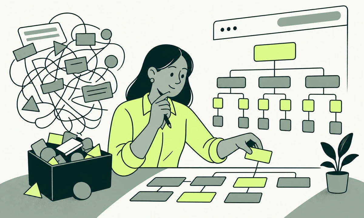
The menu has nine items. Two of them are Solutions and Services, and nobody in the room can explain the difference without drawing something. There is a Resources dropdown holding a blog, a webinar from last year and the pricing page, because pricing had nowhere else to go. Somebody has just suggested adding Industries. This is the meeting where a site stops being designed and starts being negotiated.
The instinct is to redraw the menu. It almost never works, because the menu is not the thing that broke. What broke is the structure underneath it, and a menu is only a view onto that structure. Redraw the view while the structure stays as it is and you get a tidier version of the same confusion, usually with a large hover panel attached to it.
So this piece works through website navigation architecture in the order we would actually fix it. Name the symptoms without flinching. Separate structure from navigation, because they are different objects with different owners. Decide what a mega-menu is genuinely for. Stop treating search as a patch. Then restructure in a sequence that does not throw away the URLs you already earned.
The symptoms you can name before you measure anything
You do not need analytics to know a menu has stopped working. The evidence turns up in conversation first, and it is remarkably consistent from site to site.
- Two items nobody can tell apart. Solutions and Services. Products and Platform. If your own team argues about which page something belongs on, a first-time visitor is not going to do better in four seconds.
- A Resources or More bucket. This is the kitchen drawer of your site. Everything that lost an argument lives in it, and nothing has ever been taken out.
- Pages that exist but cannot be reached. If the only route to a page is a search box or an old newsletter link, that page is not part of your site as far as most visitors are concerned.
- One page linked from four places under four names. Which tells you the label was never settled, only repeated in different rooms.
- A menu that scrolls on a laptop. Or one that needs a steady hand along a diagonal to reach the third column without it closing.
- Your own colleagues using site search to find your own pages. The quietest signal, and the most damning one.
Site structure and navigation are different objects
This is the distinction that makes everything else tractable, and almost every team collapses it into one conversation about the header.
Structure is what the site is made of
Structure is the set of things you publish and how they relate to each other: page types, the fields each one carries, their parents, their tags. A service belongs to a pillar. A case study references a service and an industry. An article belongs to a category and mentions a service. Structure is a model rather than a picture, and it exists whether or not anyone has drawn it.
It has to be right first, because everything else reads from it: the menu, the breadcrumbs, the footer, the related links under an article, the sitemap a crawler consumes, and the internal links that signal which pages you consider important. Search guidance on organising a site is largely a description of exactly this, phrased as advice rather than as a data model.
Navigation is an editorial selection from it
Navigation is a curated view: the small subset of the structure you have chosen to promote at the top of every page. It is an editorial act, and like all editorial acts it works by leaving things out. A menu containing everything has made no decisions, which is precisely why it communicates nothing.
So the first useful question is not what should go in the menu. It is what the site is made of, and only then which of those things a first-time visitor needs at the top of every page. Teams that skip the first question tend to do a website transformation twice, three years apart, and the second one is harder because it has to respect the redirects from the first. It is also worth asking, once, whether the site should be this size at all: our parent company has written about a link page, a profile site or a website, and for some businesses the honest answer is that nine top-level items were never needed.
What a mega-menu actually buys you
A mega-menu is not a failure state. It is a legitimate pattern with a specific job: showing the shape of a large and genuinely varied catalogue in a single glance, so that a visitor who already knows what they want can go straight to it without stepping through levels.
When it earns its place
It earns its place when the site holds many peer items in groups a visitor already recognises, and when those groups are stable. Retail departments. A firm with distinct practice areas. Documentation with clear product lines. The mega-menu is a map, and a map is useful when the territory actually has regions.
What it costs
The costs are not visual, which is why they are usually discovered after launch. A large hover-triggered panel has no hover to trigger on a touchscreen, so it collapses back into an accordion nobody designed and nobody tested. It is hostile to keyboard and screen-reader users unless somebody does the work deliberately: a sensible focus order, escape to close, no focus traps, and the expanded state announced correctly. Accessibility guidance is explicit about what a disclosure has to do, and treating accessibility as a default is considerably cheaper than retrofitting a panel after an audit report lands.
There is a subtler cost too. A panel with forty links absorbs any amount of new content without anyone ever having to say what the site is about. That is its most attractive property and its worst one, and it is why some mega-menus keep growing quietly for years.
Draw the panel on paper, then hand your full page list to somebody outside the team and ask them to place each page into one of your top-level groups. Count the ones they cannot place without asking a question. If that number is more than a couple, the grouping is wrong, and a mega-menu will inherit the same problem at four times the size.
Search is not a substitute for structure
At some point in every one of these projects, somebody says: let us just add search. It is a reasonable instinct and a poor plan, for one reason worth stating plainly. Site search only works for people who already know the word.
A visitor who knows they want lifecycle marketing will find lifecycle marketing. A visitor who knows only that people sign up and then vanish will search none of your vocabulary, get an empty result page, and leave without telling you. Search rewards the already-informed. Structure is what serves everybody else, including the people most likely to become customers because they have not yet decided what they need.
Two things do make search worth having. It is diagnostic: the search log is the most honest description you will ever get of what people expected to find and could not, and reading a month of it is faster than most research you could commission. And it genuinely helps returning visitors and internal teams move quickly. Neither of those is a reason to postpone the restructure, and both are better arguments for search than discoverability ever was.
The same caution applies to the newer version of the instinct, which is to put an assistant on the site and let it answer instead of the menu. A widget like Flidu can answer from your own site content and offer a contact or conversion action in the same place, which is genuinely useful for a visitor with a specific question. It still cannot tell a first-time visitor what you are made of. An assistant answers questions. Structure is what tells people which questions are available to ask.
And whatever you add has states: empty, slow, failed, no results, partial results. Those states are where search reputations are made, and they are the ones that never make it into a design file. Loading, waiting and failing is worth reading before you ship a search box, not after.
Choosing the pattern, honestly
Once the structure is settled, the pattern is a smaller decision than it feels like. Each one has a shape of site it fits and a shape it fails on.
| Pattern | Fits when | Fails when |
|---|---|---|
| Flat top bar, five to seven items | One audience, one offer, a site you can describe in a sentence | A second audience appears and every item quietly doubles |
| Simple dropdowns | Two levels, stable groups, short lists per group | A list grows past what one readable column can hold |
| Mega-menu panel | Many peer items in groups a visitor already recognises | The groups are internal jargon, or touch is the main input |
| Sidebar or in-page section nav | Deep documentation, long guides, account areas | It becomes the only route in from the homepage |
| Hub pages instead of menu depth | Many pages per topic that deserve context and real copy | The hub is a bare link list with no reason to exist |
| Search-led | Large catalogues where visitors arrive with a known term | Discovery matters, or the vocabulary is yours rather than theirs |
The pattern most teams need and least often choose is the fifth. A hub page holds explanation, ordering and context that a dropdown physically cannot. It can be found in search, linked from anywhere, read on a phone, and expanded next year without anyone reopening the header component. Menu depth is a poor place to store meaning, which is why we treat UX and UI product design as a structure exercise before it is a visual one.
The sequence that does not break what you already have
Restructuring in the wrong order is how sites lose traffic they had already earned. The order matters more than the taste, so here is the one we run.
- Inventory before opinion. Every URL, its purpose, its traffic, its last meaningful edit, and who owns it. The list will contain pages nobody remembers publishing, and that discovery alone changes the meeting.
- Decide what to delete or merge. Most overloaded menus are overloaded because nothing has ever been removed. Deletion is a structural tool and it costs nothing.
- Model the page types, not the header. What kinds of thing do you publish, what fields does each need, what does each belong to. This is the artefact every other surface reads from.
- Write the labels in customer words. Then test them by asking someone outside the company what they expect behind each one. Labels borrowed from your internal structure are the single most common cause of a menu nobody can use.
- Choose the promoted set. The handful of destinations that deserve a place on every page. Everything else is reached through hubs, breadcrumbs, in-page links and a footer that is allowed to be long.
- Plan the redirects before anything moves. One row per old URL, mapped to its nearest real equivalent, no chains, and never a blanket redirect to the homepage. This map is the artefact that decides whether the restructure holds, and it belongs to whoever owns technical SEO.
- Ship, then watch the routes people actually take. Not the aggregate numbers. The specific paths out of the pages that bring strangers in.
A menu is the shortest description of what a company sells. If yours needs a footnote, the problem is not the header.
How you know it worked
Menu changes attract opinions, and opinions get settled by whoever speaks last unless the measure was agreed in advance. So agree it in advance. Before the change ships, write down what should move: fewer sessions that reach a hub and stop there, more arrivals reaching a detail page from a category page, a fall in site searches for terms already sitting in the menu, fewer support messages asking where something is.
Then hold the line on attribution. A navigation change is rarely the only thing that shipped that month, and it takes some discipline to say what you can and cannot claim from the numbers you have. Proving a design change worked is a separate skill from making one, and it is the skill that stops you rebuilding the same menu next year on the strength of a hunch.
One more check, and it is not a usability one. Read your top-level labels aloud as a list. That list is the shortest description of your business that anybody will ever read. If it does not match the territory you have chosen to defend, then one of the two is wrong, and it is usually not the positioning.
Where we would start this week
An honest concession before the exercise. Sometimes the structure is fine and the site is simply too large for its audience, and no rearrangement fixes that. If half your pages exist because somebody once needed a landing page for a campaign that ended, the useful project is a cull rather than a redesign, and it is faster, cheaper and much less fun to present.
Assuming that is not you: one afternoon, no design software. Print the top level of your menu and ask three people who do not work with you to say, for each item, what they expect to find behind it and who it is for. Write down what they say rather than what you meant. Most of the argument in the original meeting dissolves in about twenty minutes of this.
Then do the harder half. For every page you consider important, write out the route a first-time visitor takes to reach it from the homepage. If a route needs more than three steps, or begins with the search box, that page is not really in your site structure. It is merely in your content system, which is not the same thing and never has been. Where those routes are missing, the fix is usually a hub page and a handful of honest links rather than a rebuild of the header, and that is the cheapest useful outcome this exercise produces. Anything deeper belongs with the website design and development work it will inevitably become. If you would like another pair of eyes on a structure you already suspect is wrong, send us the menu and the list of pages hiding behind it.
Common questions.
How many items should a website menu have?
Around five to seven top-level items is a workable ceiling for most sites, but the number is a symptom rather than the rule. What matters is whether a stranger can predict what sits behind each label. If two labels overlap, or one is a catch-all called Resources or More, reducing the count without fixing the grouping simply hides the problem behind a dropdown.
What is the difference between information architecture and navigation?
Information architecture is the structure of everything you publish: page types, their fields, their relationships and their hierarchy. Navigation is an edited selection from that structure, promoted to the top of every page. The architecture exists whether or not anyone designed it, while navigation is a deliberate editorial choice. Fixing navigation without fixing architecture only rearranges the symptoms.
Are mega-menus bad for usability?
No, but they are frequently misused. A mega-menu suits a large catalogue whose groups a visitor already recognises, and it fails when the groups are internal jargon or when most visitors are on touchscreens where hover does not exist. It also needs deliberate keyboard support, escape-to-close behaviour and correct state announcement, none of which arrive by default.
Should I add site search instead of reorganising my navigation?
Search helps people who already know the right word, so it cannot replace structure for first-time visitors who do not. Add it for returning users and internal teams, and read the query log as research, because it is the most honest record of what people expected and could not find. Then still do the restructure.
Will changing my site navigation affect search visibility?
It can, and the mechanism is worth understanding rather than fearing. Internal links signal which pages you consider important, so promoting or demoting a page changes that signal. The larger risk is URL changes without a clean redirect map. Map every old URL to its nearest real equivalent, avoid redirect chains, and never send everything to the homepage.
What is a hub page and when should I use one?
A hub page is a real page that introduces a topic and links to everything beneath it, with context a dropdown cannot hold. Use one whenever a group has enough pages that a menu column becomes unreadable, or when visitors need explanation before they can choose. Hubs are linkable, searchable and easy to expand later without touching the header.
Facing this in your
own business?
Tell us where you’re headed — we’ll map the shortest honest route.