

Dark Mode: What It Costs and When It Is Worth It
Dark mode design is not a switch. It is a second set of tokens, a second contrast audit, a second image treatment and a second QA pass, and some sites should not take it on.
On This Page
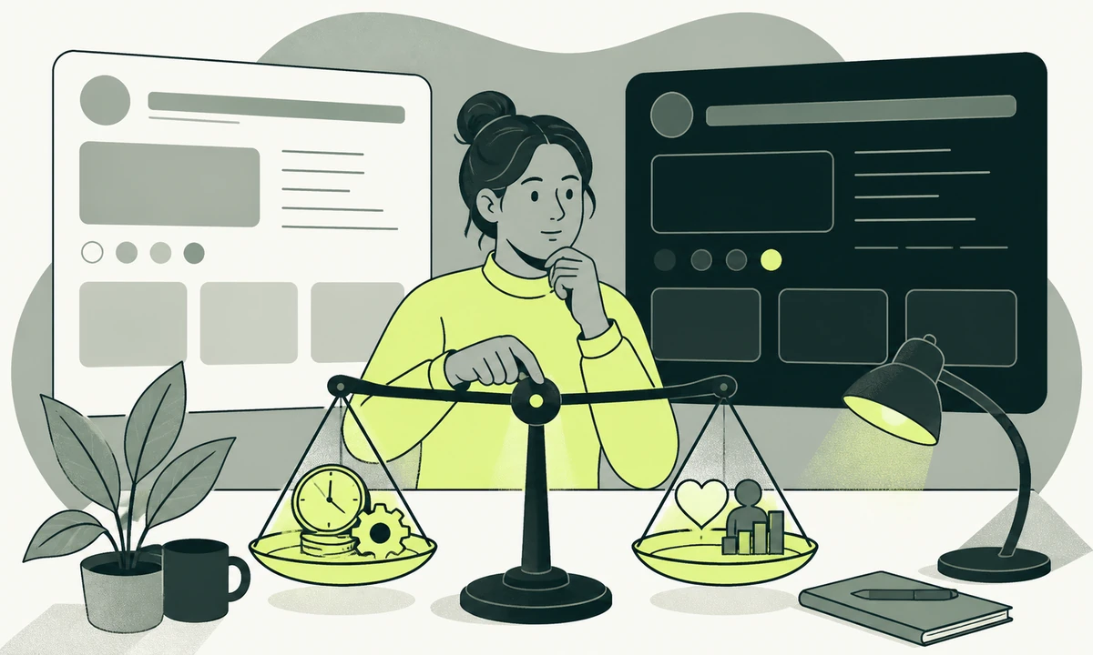
The ticket says "add dark mode". It sits in the backlog next to "fix the footer padding" and it gets estimated the same way. Then somebody opens the design file and finds that the brand accent which reads as confident on white reads as radioactive on near-black, that every product screenshot has a white background baked into the PNG, and that nobody can say what a disabled button is meant to look like on a page that is already dark.
Dark mode design is a system decision. Not a preference, not a toggle, not a stylesheet you bolt on in the last sprint. It is a second set of nearly everything: surfaces, borders, states, depth, charts, imagery, and the review pass that keeps all of it honest. Ship it as a switch and you get a site that looks right on the three screens somebody remembered to check.
None of that is an argument against it. Plenty of sites should have it and a few genuinely need it. It is an argument for pricing it before it is promised, which makes it a question for UX and product design rather than a styling ticket. The cost lands in four places: token architecture, contrast, imagery and testing. We will take them in that order, and finish by naming the sites we would tell to decline.
What dark mode design actually duplicates
A theme is not a palette. A theme is a mapping from every meaning in your interface to a value, and you are about to maintain two of those mappings that have to agree on meaning while disagreeing on value. The palette is the small part. The mapping is the work.
Here is what quietly becomes two things the moment the second theme exists.
- Every surface. Page, card, sunken panel, sticky header, overlay, popover, tooltip. Light themes get away with three. Dark themes usually need more.
- Every border and divider. On white, a divider is a darker grey. On near-black it has to be a lighter one, which changes its perceived weight and often its width.
- Every state. Hover, active, focus, disabled, selected, error, warning, success. Eight states across a dozen components is a lot of small decisions nobody put in the estimate.
- Every image with a baked background. Logos delivered as flat PNGs, partner marks you do not own, screenshots, cut-out photography, favicons.
- Every chart, diagram and code block. Each carries its own palette, its own gridlines and its own syntax colours, and none of them invert cleanly.
- Every third-party embed. Maps, hosted payment fields, video players, chat widgets. Some can be themed. Some cannot, and you will be designing a frame around a white box.
Most of that list is invisible in a design file showing three screens. It becomes visible in week six, when somebody loads a hosted card field onto a dark checkout and finds a white rectangle sitting in the middle of it with a grey border you cannot change. The rule worth carrying out of this section: a theme is a property of the system, never a property of a page. If it is not true in your codebase yet, that is the first thing to fix.
Token architecture decides how bad this gets
The difference between a two-week theme and a two-quarter theme is almost entirely decided before the second theme is drawn. It is decided by how the first one names its colours.
Name tokens for their job, not their colour
A codebase full of names like grey-100 and blue-600 cannot be themed, only rewritten, because the name asserts a value. A codebase with two layers can: a primitive palette that holds the raw values, and a semantic layer that maps meaning onto it. Surface, surface-raised, text-primary, text-muted, border-subtle, accent-on-dark. Only the semantic layer swaps. Every component reads the semantic name and never touches a raw value.
This is worth doing whether or not the second theme ever ships. It is the change that makes a rebrand, a high-contrast mode and a white-label deployment cheap, and dark mode is simply the first thing that proves the layer works.
Depth stops being a shadow
In a light interface, depth comes from shadow: a card floats because it casts something. On a near-black surface a shadow is close to invisible, so depth has to come from lightness instead. The higher a surface sits, the lighter it gets. That is not an inversion of your light theme, it is a different model, and it is why a dark theme usually needs more surface steps than the light one it came from.
It is also the strongest argument for assembling pages from structured components rather than bespoke layouts. A theme applied to a component library is one change. A theme applied to forty hand-built pages is forty. Nichevio builds profile sites out of structured, customisable widgets for exactly this reason: the widget knows what a surface is, so the page never has to be told twice.
Contrast has to hold twice
WCAG 2.2 asks for a contrast ratio of at least 4.5:1 for normal text, 3:1 for large text, and 3:1 for user interface components and focus indicators. Those thresholds do not soften because the background got darker. What changes is which of your colours can still reach them, and the honest answer is usually fewer than you hoped. Our accessibility commitment applies to both themes or it applies to neither, and a badly contrasted dark theme is worse than a single well-contrasted light one.
The accent is where this bites first. A brand colour tuned to sit on white almost never clears 4.5:1 against near-black at the same value, so you need a second value. Then the two values have to still read as the same brand to somebody who sees only one of them. Hold the hue, move the lightness. Substituting a different colour for the dark theme is how a brand quietly becomes two brands.
Pure black and pure white are both traps
Maximum contrast is not maximum readability. Pure white text on pure black produces a halo effect around letterforms that makes long passages tiring, particularly for readers with astigmatism. The usual answer is a near-black surface and an off-white text colour, which loses a little contrast on paper and gains a lot in practice. Keep true black for a deliberate OLED setting if your product has a reason for one, and do not make it the default.
The screens that fail here are the ones nobody drew. An empty state whose illustration was inked for white paper. A skeleton loader invisible against a dark surface. An error message whose red now sits below threshold. We wrote separately about designing the states nobody mocks up, and every one of them needs a second treatment before launch, not after.
A single focus colour rarely clears 3:1 against both a white surface and a near-black one. The reliable fix is a two-tone ring, an inner and an outer stroke in contrasting values, so one of the two always separates from whatever is behind it. Test it on your darkest surface and your lightest card, not on the body background.
Imagery is the line item nobody budgets
Colour tokens are tractable. Assets are not, because half of them are files somebody else made and the other half are files nobody can find the source for.
Logos come first. A wordmark supplied as black artwork on transparency simply disappears on a dark page, so you need a light lock-up and a rule about which one loads when. Partner and client marks are the harder case: you are usually not permitted to recolour them, which means a neutral chip or plate behind each one, designed rather than improvised. Photography needs a pass too. Cut-outs shot against white carry a halo when they land on near-black, and images that are largely white become a lightbox in the middle of a dark page.
Then there are charts, diagrams and screenshots. A series palette that separates cleanly on white will not separate on dark, gridlines have to move, and every documentation screenshot is now either wrong or duplicated. The tension underneath all of it is recognition: the value that makes you identifiable is the one that breaks first. That is the subject of why looking different pays, and it is why the safe move is a lightness shift rather than a colour swap. If you carry more than one brand, the multiplication is real, and the decision belongs with the brand architecture rather than with the front end team.
How the theme gets chosen matters as much as how it looks
There are four ways to offer a second theme and they are not equivalent. Three of them are defensible and one of them is a shortcut that looks free for about a week.
| Approach | What it costs | Where it breaks |
|---|---|---|
| Follow the operating system only | One extra token set, no stored state | A visitor who wants the other theme on your site has no way to ask |
| A manual toggle only | Token set, a control, storage, and a chosen default | You ignore a preference the visitor already expressed everywhere else |
| System default with a toggle that overrides it | All of the above plus a three-state control | Server-rendered pages flash the wrong theme unless the choice is resolved before paint |
| A CSS filter that inverts the whole page | Almost nothing up front | Photographs, logos and brand colours invert too, and text contrast becomes accidental |
We would ship the third row: follow the system by default, offer a control with three positions rather than two, remember the choice, and resolve it in a small inline script before any styled content renders. Where that control lives is a navigation problem, and on a site that has already outgrown its menu it is one more thing competing for header space. A footer control is acceptable. A control nobody can find is not.
The testing burden more than doubles
Two themes do not mean twice the checks. They mean twice the checks multiplied by everything else you already vary: viewport widths, reduced motion, forced colours, logged-in and logged-out, error and empty states, and every language you publish in. The matrix grows by multiplication and the team grows by nothing.
Forced-colours mode is the part most teams discover late. It is effectively a third theme, imposed by the operating system, in which your carefully chosen values are replaced wholesale by the user’s own. A design that leans on background colour to convey meaning, a status pill for example, loses that meaning entirely. Anything conveyed by colour needs a second signal: a label, an icon, a border, a shape.
Automated tooling helps with part of this and not the rest. Contrast auditors catch text sitting on a background they can compute; they do not catch a white PNG on a dark card, a chart series that has collapsed into one colour, or an embedded payment field. Budget human eyes for those. And if the reason for shipping the theme is that people asked, agree in advance what evidence would show it helped, which is the question we take up in how do you prove a design change worked.
A theme you cannot test is a theme you cannot maintain. The second palette is cheap. The second review pass is the bill, and it arrives every release.
Who should skip dark mode
This is the part vendors leave out, so we will be direct. Four kinds of site should say no, at least for now.
- The small brochure site. A dozen pages, updated quarterly, no logged-in state, a brand built on a light palette. Nobody reads it for two hours at midnight. The maintenance cost outlives the novelty within a year.
- Any team without a design system. Adding a theme to bespoke pages does not give you two good sites. It gives you two half-finished ones and a backlog that never empties.
- Sites built on imagery you do not control. Galleries, press pages, partner directories, user-uploaded media. You will spend the effort on plates and frames rather than on the interface.
- A product mid-rebrand. Settle one palette, live with it for a quarter, then add the second. Designing two themes for a brand still in motion means drawing everything twice.
The honest counter-case, and it is a strong one: if people use your product for hours at a stretch, often at night, and have asked for a dark theme by name, the argument reverses completely. Editors, dashboards, monitoring tools, reading applications and developer tooling all sit here. For those, a dark theme is a feature rather than a finish, and it belongs in product improvement work with a real slice of the roadmap behind it.
If you are doing it, do it in this order
Search the codebase for every colour value in use and put the results in one list. If that list is materially longer than your documented palette, you do not have a theming problem yet. You have a consistency problem, and adding a second theme on top of it will multiply the mess rather than expose it.
- Inventory every colour actually rendered, then reduce it to a palette you can name.
- Introduce the semantic token layer with the light theme as the only theme, and ship it. Done properly, nothing looks different and that is the point.
- Draw the dark surfaces and text values first, before any accent. Depth before decoration, because depth is the part that has no light-theme equivalent.
- Resolve the accent against both themes, holding the hue and moving the lightness until both clear their thresholds.
- Work through the assets: light lock-ups, partner plates, chart palettes, code themes, screenshots, third-party embeds.
- Add the control, the persistence and the pre-paint resolution, in that order, and test the first paint on a slow connection.
- Extend whatever visual checks you already run to cover both themes, and delete the ones nobody was ever going to read.
Steps one and two carry most of the value. A team that stops there has a better codebase than it started with and has lost nothing, which is a reasonable place to pause if the second theme turns out to be lower priority than it looked in the backlog.
The rule we would apply
Ship a second theme when two conditions are already true: you have a semantic token layer and a component library, and a named person owns the second review pass for the life of the product. If either is missing, build the token layer first and treat the dark theme as the thing that proves it works. That sequence gets you a better system whichever way the theme decision goes.
The condition that reverses this: a product used for long sessions in low light by people who have asked for it. Then the cost stops being a cost and becomes the feature, and the right response is to build the token layer quickly rather than to argue about whether the theme is worth it.
The failure mode we see most often is neither of those. It is a theme shipped by one enthusiastic developer, half-reviewed, then slowly abandoned as new components arrive without dark values, until the site has a mode that works only on the pages nobody has touched for a year. If that describes yours, tell us what is drifting and we will start with the token layer rather than the palette.
Common questions.
Is dark mode required for accessibility?
No. WCAG 2.2 does not require a dark theme, and a well-built light interface can meet every success criterion on its own. What accessibility does require is that whichever themes you ship meet the contrast thresholds for text, interface components and focus indicators. A poorly contrasted dark theme is less accessible than a single carefully contrasted light one, so shipping one badly is a step backwards.
Should a theme follow the operating system or use a toggle?
Both, in that order. Follow the operating system preference by default, then offer a control with three positions, system, light and dark, that lets a visitor override it and remembers the choice. Following the system alone leaves people who want the other theme on your site with no way to ask for it. A toggle alone ignores a preference they have already set everywhere else.
What causes the flash of the wrong theme when a page loads?
The flash happens when the page paints before the stored preference has been read. Server-rendered HTML arrives carrying a default theme, then a script runs, finds the saved choice and swaps it, so the visitor watches one theme replaced by another. The fix is to resolve the theme in a small inline script in the document head, before any styled content renders.
Can I make a dark theme by inverting colours with a CSS filter?
You can, and it will look wrong within a screen or two. An inversion filter reverses photographs, logos and brand colours along with the interface, so faces turn strange and a familiar red becomes cyan. Text contrast becomes accidental rather than designed, and nothing can be tuned per component. Filters are a reasonable debugging trick and a poor product decision.
What contrast ratios does a dark theme have to meet?
The same ones a light theme meets. WCAG 2.2 asks for a contrast ratio of at least 4.5:1 for normal text, 3:1 for large text, and 3:1 for interface components and focus indicators. Those thresholds are independent of how dark the background is. The practical consequence is that most brand accents need a second, lighter value before they clear the bar on dark surfaces.
How long does adding a second theme actually take?
It depends almost entirely on whether semantic tokens already exist. With a token layer and a component library, the theme is a set of value swaps plus asset work, measured in sprints. Without them, the first job is refactoring every hard-coded colour in the codebase, which is a larger piece of work than the theme itself and should be scoped and approved separately.
Facing this in your
own business?
Tell us where you’re headed — we’ll map the shortest honest route.