

Where Does a Floating Chat Widget Fail a Screen Reader?
Automated scans happily pass a chat widget that nobody can use without a mouse. The failures sit in focus, announcements, dismissal and reading order, and every one of them is fixable before launch.
On This Page
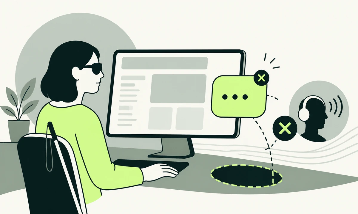
Tab through your own homepage without touching the mouse. Somewhere after the last footer link, focus vanishes. It has moved into the chat widget, which sits at the very end of the document and draws its own button with its own styles and no focus outline. Press Enter anyway. Something probably opened, though nothing said so.
That is one failure. There are about five, and an automated scan catches none of them, because the scan runs against the widget in its closed state and reports a button with a label on it. An accessible chat widget is not one that passes a checker. It is one a person can open, read, answer and close using a keyboard alone, and hear what happened while doing it.
The reason widgets fail is structural rather than careless. A floating chat is three difficult components welded together: a control that outlives every page, a dialog that appears over content, and a log that updates on its own while the user is somewhere else. Each has a well-documented pattern. Almost nothing ships with all three implemented, which is why this keeps turning up in product design reviews long after launch.
What a floating chat widget actually is
Pull it apart before you fix anything. The three pieces have different rules and different failure modes, and teams that treat them as one component end up with a single aria-label and a lot of optimism.
- A persistent launcher. A control that appears on every page, is usually injected after load, and floats above content it did not ask permission to cover.
- A dialog. A panel that opens over the page. Whether it is modal decides where focus goes, what is trapped, and what the rest of the page is allowed to do.
- A live log. Messages arrive without the user acting. Something has to announce them once, at the right level of interruption, and no more than once.
Kept separate, the work is tractable and mostly known. Kept together, it becomes an argument about a component nobody wants to own. We treat all three as part of the accessibility commitment rather than as a vendor problem, because visitors do not care who wrote the script.
The launcher button
Start here, because everything else is downstream of it. The launcher is the only part of the widget that every visitor meets, and it is the part most often built wrong.
Naming it properly
It has to be a real button element. A div with a click handler is not focusable, does not respond to the space key, and is announced as nothing at all. Adding a role to a div gets you halfway and leaves you maintaining keyboard behaviour the platform would have given you free.
The accessible name should say what pressing it does, not what the icon depicts. "Chat" is thin. "Open chat with support" tells somebody whether it is worth the keystroke. If the button carries an unread count, that count belongs in the name or in a status message rather than only in a coloured circle. This is microcopy work as much as engineering, and it is usually the cheapest improvement available on the whole component.
The same applies to the greeting bubble that pops out on a timer. It is one sentence, it is often the first thing a visitor reads, and it deserves the same scrutiny as any other sentence somebody has to act on. If your team has done the work of writing messaging people can repeat, the widget is not the place to abandon it for a wave emoji.
Where it sits
Position creates two separate problems. A fixed bottom-right button covers whatever is at the bottom-right of the page, which on mobile is frequently the primary call to action. And when a keyboard user tabs to a link underneath it, the launcher hides the thing that now has focus. WCAG 2.2 names this directly in Focus Not Obscured, and a floating widget is the most common way sites fail it.
Two more from the same version are worth checking while you are there. Target Size sets a floor on how small the launcher and its close control may be, which matters because widgets love a tiny dismiss cross. Consistent Help asks that a help mechanism appear in the same relative order across pages, so a launcher that moves between templates, or disappears on checkout, is a problem rather than a styling choice.
Focus management, opening and closing
This is where most widgets fail hardest, and it is also the part that is completely specified. There is no ambiguity about what should happen. There is only whether anybody implemented it.
On open
Focus moves into the panel. Not to the body, not left sitting on the launcher while a panel appears silently elsewhere. Send it to the panel container, given a heading and a name, or to the message input if the user is expected to type immediately. The panel needs a role that says it is a dialog and a name that says which dialog.
Then decide modality on purpose. A modal panel traps focus, hides the rest of the page from assistive technology, and blocks reading the content the visitor came for. A non-modal panel leaves the page reachable and needs a clear route back into it. Our default on a marketing site is non-modal, because the most common reason to open a chat is to ask about something visible on the page, and a modal makes that impossible without closing the panel. Modal is right when the chat is the task rather than a companion to it.
On close
Escape closes the panel. Focus returns to the launcher, every single time, including when the panel closed for a reason the user did not trigger. Unmounting a panel while focus is inside it drops focus to the top of the document, which for a screen reader user means losing their place on a page they had already read once.
The close control itself has to be reachable by keyboard and named as something more useful than a cross glyph. And closing must actually close. A panel that collapses into a bubble which reopens on the next page load has not been dismissed, it has been postponed.
Unplug the mouse. From the top of the page, tab to the launcher, open it, type a message, read the reply, close it, and continue reading the page from where you were. If any step needs a pointer, the widget is not ready. Run it before you book anything more elaborate, because it catches more than a session with five users will, and it costs a coffee break.
Announcing replies without shouting
A reply that arrives silently is a reply that did not arrive. The transcript needs a live region so new messages are announced while the user is elsewhere, and the setting should be polite rather than assertive. Assertive interrupts whatever is being read, which is right for an error and wrong for a support answer.
The classic bug is a live region created at the same moment as the message inside it. A region that appears already populated announces nothing, because there was no change to observe. The container must exist in the document first, empty, and receive content afterwards. That one line of sequencing explains a surprising share of widgets that are silent in testing and fine in code review.
Streaming answers make it harder. If tokens land in the live region one at a time, the region is re-announced on every mutation and the result is unusable noise. Buffer the response and announce the completed message, or announce a short status such as a reply arriving and let the reader move into the transcript themselves. Typing indicators deserve the same restraint: an animated ellipsis is decoration, and turning it into a repeated announcement is worse than leaving it silent.
A widget that carries more than chat has more to announce. Flidu bundles website-informed assistance with contact, information and conversion actions in one widget, and that shape is worth naming: when a form appears inside the panel, it is a new region with its own labels, its own required fields and its own error announcements. It is not a chat message that happens to contain inputs. Our parent company set the same requirements out from the build side in an accessible chat widget.
Dismissal, obstruction and the theme it ignores
Anything that appears over content must be dismissible without moving the pointer, must stay visible long enough to read, and must not obscure other content while it is up. That is a rule about tooltips and it applies just as squarely to the greeting bubble a chat widget throws out four seconds after load.
Auto-opening the whole panel is worse. Consider somebody using screen magnification, for whom a panel appearing in a corner they are not looking at stays invisible until they hit a wall of focus they did not expect. If you must auto-open, do it once per visitor, honour the dismissal for the session at minimum, and never do it on a page where somebody is entering payment details.
The panel also carries its own colour scheme, and a widget that ignores the site theme produces a bright white rectangle on a dark page at eleven at night. That is a contrast question and a comfort question at once. If you support a dark theme, the widget is part of the theme rather than an exception to it, which is another line in the ledger of what dark mode costs.
Reading order and where the widget lives
Injected widgets append themselves to the end of the body. Visually the launcher floats above everything; in the document it is the last thing on the page. For somebody reading in document order that is defensible, since help belongs near the end. For a keyboard user it means tabbing past every link on the page to reach the one control offering help, which is exactly backwards.
There are two honest fixes. Give the widget a landmark and a heading so it can be jumped to directly, which costs almost nothing. Or render it inside the page you control, in a position you chose, which is only possible when the widget is yours. Third-party scripts rarely allow that, and the constraint is a genuine input to the build decision rather than a detail: the tension our parent company describes between client work and product work shows up here as who is allowed to change the focus order.
What you should not do is reach for a positive tabindex to pull the launcher forward. It works for exactly one page, breaks the moment another component does the same thing, and leaves whoever inherits the codebase with a focus order nobody can predict from reading the markup.
The requirements a widget must meet before it ships
A short list, because each item is a pass or a fail rather than a judgement. If a vendor cannot answer these, you have learned something useful about the vendor.
- The launcher is a button, reachable by keyboard, with a visible focus style. Its name describes the action, not the icon.
- Opening moves focus into the panel, and the panel announces itself as a dialog with a name.
- Escape closes it and focus returns to the launcher, including when the panel closed on its own.
- New messages are announced once, politely, from a live region that existed before the message did.
- Nothing it draws obscures a focused element, and its controls meet the minimum target size on a phone.
- Dismissal persists for at least the session, on every page, without exception.
- The panel works at high zoom on a narrow viewport, without a horizontal scrollbar and without clipping the input.
The table below is the same list read from the other end: what the visitor experiences when an item is missing. We find this version more persuasive in a room where somebody is defending a purchase.
| What is missing | What the visitor experiences | The fix |
|---|---|---|
| Focus move on open | The panel is open and the user is still on the launcher, with no idea anything changed | Move focus to the panel container or the input |
| Focus return on close | Focus drops to the top of the document and the reading position is lost | Restore focus to the launcher on every close path |
| A live region | Replies arrive in silence, so the user has to keep checking manually | A polite live region present in the document before the first message |
| Escape handling | The panel can be opened by keyboard and not closed by one | Bind Escape, and give the close control a real name |
| Persistent dismissal | The widget reappears on every page, over the content being read | Store the dismissal and honour it for the session |
| Theme and contrast parity | A bright panel on a dark page, or text below contrast minimums | Treat the widget as part of the design system, not an add-on |
What this costs, and when not to have a widget at all
None of this is free. Focus management and live regions add real engineering time, buffering a streamed reply is fiddly, and testing properly means installing a screen reader and learning enough of it to be dangerous. Budget for it once and the component is done. Skip it and you pay in support tickets nobody ever traces back to the cause.
The harder concession is this: if you bought a third-party widget, you probably cannot fix most of it. You can restyle the button and you cannot rewrite its focus behaviour, and no amount of custom CSS turns a div into a button. That leaves three options, all of them decisions rather than workarounds: raise it with the vendor and get a date, build your own, or remove it and put the answer on the page instead.
The third option is underrated. A page that answers the question outright beats a widget offering to answer it, and it works for people who would never open a chat in the first place. There is a performance argument as well: a script loading on every page for a feature a minority use is one of the reliable reasons a site is fast in the lab and slow for real users.
A widget that cannot be opened, read and closed from the keyboard is not a support channel. It is a decorative button that files tickets for the people who did not need help.
If you are starting today, do the keyboard walkthrough first and write down where it breaks. Fix focus on open and focus on close before anything else, because those two account for most of the damage. Then the live region, then dismissal, then the theme. Test with a screen reader in the browser your visitors actually use rather than the one that is convenient. If you would rather somebody else ran that pass over a widget already in production, send us the page it lives on and we will tell you which of the six rows above apply.
Common questions.
What makes a chat widget accessible?
An accessible chat widget can be opened, read, answered and closed with a keyboard alone, and it tells assistive technology what changed at each step. In practice that means a real button as the launcher, focus moving into the panel on open, Escape closing it with focus returning to the launcher, and new messages announced once through a polite live region.
Should a chat panel be modal or non-modal?
It depends on whether the chat is the task or a companion to the page. On a marketing site, non-modal is usually right, because visitors open chat to ask about something they can see and a modal hides that content from them. Choose modal when the conversation is the whole point of the screen, and then trap focus properly and hide the rest of the page.
Which live region setting should chat messages use?
Use a polite live region for incoming messages. Assertive interrupts whatever is currently being read, which suits an error or a session timeout and is intrusive for a support reply. The region must be present in the document before content is inserted, since a region that appears already filled produces no announcement at all.
Why does my chat widget pass an automated scan but still fail users?
Automated scans check the page in one state, usually with the widget closed, and they can confirm a button has a label. They cannot judge whether focus moved when the panel opened, whether Escape closes it, whether a reply was announced, or whether the launcher covers a focused link. Those are behaviours over time, and they need a manual keyboard and screen reader pass.
Does a floating chat button break WCAG 2.2?
It can, in three specific ways. Focus Not Obscured is failed when the floating element hides whatever currently has focus. Target Size is failed when the launcher or its close control is too small on a phone. Consistent Help is failed when the widget appears in a different relative position on different pages, or disappears on some templates entirely.
Can I fix a third-party chat widget I did not build?
Usually only partially. Styling, position and colour are normally in your control, while focus behaviour, roles and live regions sit inside the vendor script and cannot be patched reliably from outside. Raise the specific failures with the vendor and ask for a date, and treat replacing or removing the widget as a real option if the answer stays vague.
Facing this in your
own business?
Tell us where you’re headed — we’ll map the shortest honest route.