

Loading, Waiting, Failing: Designing the States Nobody Mocks Up
People judge quality in the seconds when nothing has arrived yet. Loading and error states are design decisions rather than engineering leftovers, and they are the screens nobody bothers to mock up.
On This Page
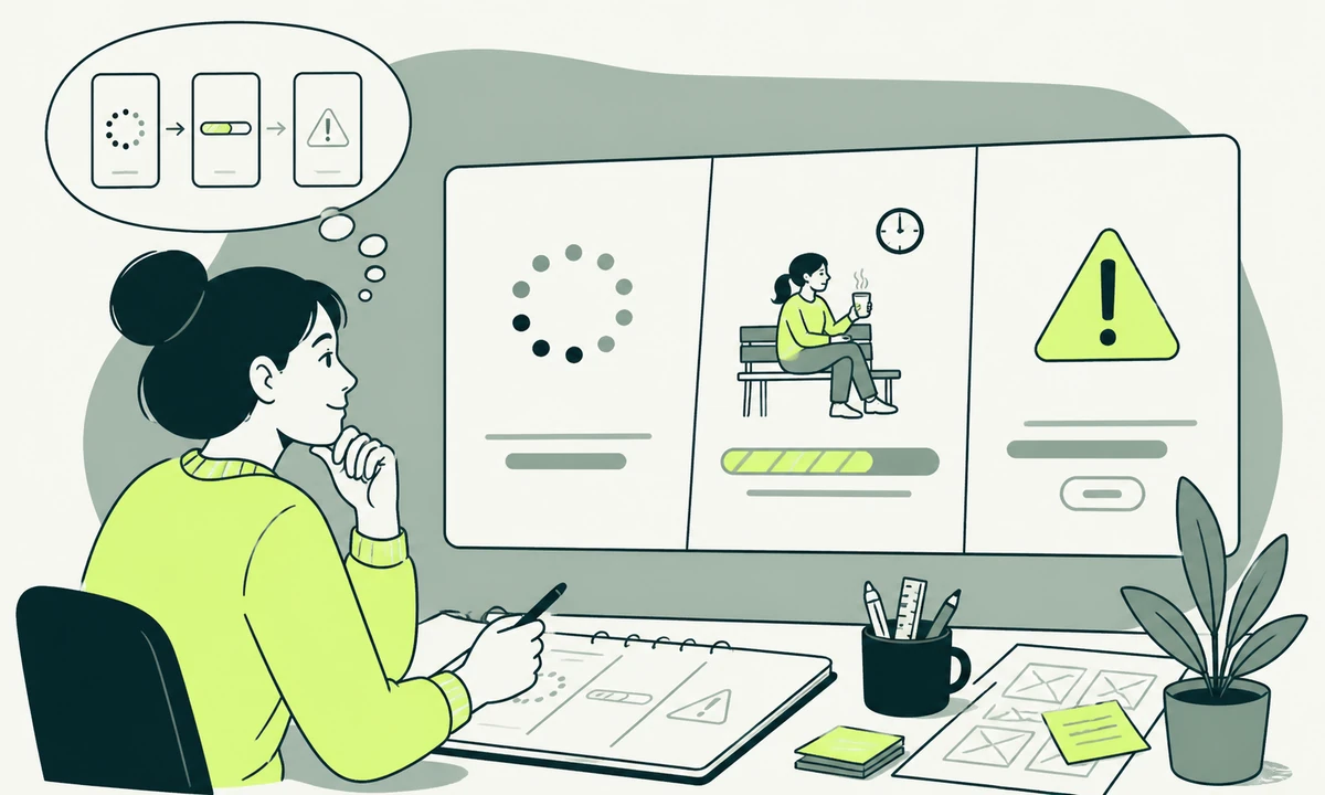
Open any design file for a product feature and count the frames. There will be the empty version, the populated version, maybe a hover state, and a neat little flow diagram. There will not be a frame for the two seconds after the button is pressed, the version where the request never comes back, or the version where it returns a validation error from a service nobody on the team controls. Those get written in code, at the end, by whoever is closest to the deadline.
And those are the frames the user judges you on. Loading and error states decide perceived quality more than the layout does, because the happy path is where a product merely meets expectations and the in-between is where it either holds its nerve or falls apart. Nobody remembers a table that rendered correctly. Everybody remembers the spinner that never stopped.
This piece is about the four states that never get mocked up: waiting, waiting too long, succeeding before the server agrees, and failing. Each one has a small number of defensible answers and a large number of habits that persist because nobody ever designed them on purpose.
Where loading and error states decide perceived quality
Speed is a feeling before it is a measurement. Two interfaces can complete the same request in the same time and feel completely different, depending on whether the screen kept its shape, whether the thing you clicked acknowledged you, and whether anything moved that did not need to. This is ordinary product design work, and it is routinely handed to engineers as an implementation detail with no guidance attached.
It also explains a specific and common disappointment: the redesign that tests beautifully and then performs worse than the page it replaced. Very often the new design is better on every mocked frame and worse on every unmocked one, which is why we treat a redesign that converts worse as a states problem until proven otherwise. The old page had five years of quietly accumulated handling for the ugly cases. The new one has a design system.
Nobody experiences your average response time. They experience the slowest thing they waited for today, and they generalise from it.
Spinner, skeleton, or nothing at all
The default reflex is to show a spinner for everything. That is worse than it looks, because a spinner communicates exactly one thing: something is happening, somewhere, for an unknown length of time. It has no shape, no ceiling and no relationship to the content it is standing in for.
The bands we design to
These are working conventions rather than measurements, and they hold up well in practice. Match the treatment to how long the wait is and to how much you know about what is coming back.
| The wait | What to show | Why | The usual mistake |
|---|---|---|---|
| Barely perceptible | Nothing at all | An indicator that appears and vanishes reads as a glitch | A spinner on every request, including instant ones |
| Short, layout known | A skeleton of the real layout | The page keeps its shape and nothing jumps when data lands | A skeleton that does not match what actually arrives |
| Short, layout unknown | An inline indicator on the element that is busy | The busy thing is already where the eye is | A full-screen overlay because one button was pressed |
| Long, progress measurable | A determinate bar with a count of what is done | Visible movement makes a wait tolerable | A bar that stalls near the end with no explanation |
| Long, progress unmeasurable | A named step, changing as steps complete | Named work reads as work; a spinner reads as a hang | One unlabelled spinner for a multi-stage job |
| Longer than anyone will sit through | Release the person and notify on completion | Holding a tab hostage is a design failure, not a constraint | Warning the user not to close the window |
Two rules for skeletons
First, a skeleton must be a truthful outline of what is coming. If it shows three rows and one arrives, you have designed a small betrayal. Second, hold the space. A skeleton exists mainly to stop the layout shifting under a cursor or a thumb, and one that is the wrong height does the opposite of its job.
Animated skeletons need a reduced-motion path, and they need to stop. A shimmer that runs for thirty seconds tells the user the app is alive while telling them nothing about whether it is stuck. Give every indeterminate indicator a ceiling, after which it becomes a message instead.
Optimistic updates, and how to take them back
An optimistic update shows the result before the server has confirmed it. Toggle a switch and it moves immediately; the request follows behind. Done well, this is the single largest improvement available to a product’s felt responsiveness, because it removes the wait from the interaction entirely.
Done badly, it is lying to the user. The rule we apply is narrow and it holds: be optimistic when the action is reversible, cheap to retry, and almost always succeeds. Liking, reordering, renaming, marking as read, toggling a preference. Never be optimistic about money, deletion, sending a message to another human, or anything that triggers work outside your own system. In web application development terms, the test is whether you can undo the local change without an apology.
Unwinding one in public
When the request eventually fails, the reversal has to be visible, specific and non-destructive. Roll the element back to its previous state, say plainly which action failed, and keep whatever the person typed. The failure that turns a small annoyance into a support ticket is the one that quietly discards input while the interface pretends nothing happened.
Timeouts, retries and the long tail
Every request needs a ceiling, and the ceiling belongs to design as much as to engineering. Without one, a stalled request produces an interface that waits forever with perfect composure, which is the worst available combination of confidence and uselessness.
Retries are the other half. Retry automatically once for a transient network failure, quietly, with a short delay. After that, hand control back: say the request is taking longer than expected, name what is being attempted, and give a button. Silent infinite retrying burns battery, hammers your own servers during an incident, and leaves the person with no way to tell whether waiting is rational.
There is a third case people forget: the request that succeeds after the user gave up. If a slow save lands after someone has navigated away or edited the same field again, deciding what happens is a product decision. Last write wins is a choice, not a default, and it should be made deliberately rather than inherited from whichever library is in front.
Error messages that say what to do next
Most error copy answers the wrong question. It reports what the system experienced instead of telling the person what to do. "Something went wrong" is the purest form of this: technically true, entirely useless, and mildly insulting to someone who has just lost twenty minutes of work.
A usable error message carries four things, and it can usually carry them in two sentences.
- What failed, in the user’s terms. The invoice did not send. The file did not upload. Not "an error occurred in the request handler".
- Whether their work survived. This is the first thing a person actually wants to know, and it is the thing error copy leaves out most often. Say it before the cause.
- What to do now. Retry, change one field, wait, or contact someone. If there is genuinely nothing the person can do, say that too, and say who is already looking at it.
- A reference, where it helps. A short code or identifier turns a frustrating support conversation into a lookup. Keep it selectable, and keep it out of the first sentence.
Put errors where the problem is. A validation message at the top of a long form makes the person hunt; a message beside the field they got wrong does not. This is also an argument for asking less in the first place, which is the whole point of deciding how many fields a contact form should have, and it is why our parent company describes a form as a triage instrument rather than a data collection exercise.
The wording of all this belongs to the same governance as everything else you publish. Error copy written feature by feature drifts within a quarter, which is exactly what a tone of voice document that changes copy exists to stop. And when the honest next step is a person rather than a retry, the route to one should already be in the interface. A lightweight widget such as Flidu carries website-informed answers alongside contact and information actions, which is a reasonable way to offer help at the moment of failure without building a support console.
Make the inventory before the mockups
The reason these states go missing is procedural, not philosophical. Nobody wrote them down, so nobody designed them, so nobody reviewed them. Fixing that is cheap and takes about an hour per screen.
- List every request the screen makes. Including the ones triggered on mount, on scroll, and by a component someone else owns.
- Write the states for each one. Idle, loading, partial, empty, error, offline, permission-denied, stale. Not every screen needs all eight, but the ones you drop should be dropped on purpose.
- Decide who owns the wait. The whole page, one region, or a single control. This single decision removes most full-screen overlays from a product.
- Write the copy in the inventory, not in the code. A writer can produce twenty error strings in a morning. An engineer produces them one at a time, under pressure, in the voice of the stack trace.
- Test them by breaking things on purpose. Throttle the connection, kill the endpoint, revoke the token, return a malformed payload. Anything you have not seen fail is a state you have not designed.
Try building one feature in reverse order: error state first, then loading, then the populated screen. It sounds perverse and it works, because the questions raised while designing the failure are the ones that would otherwise surface two days before launch. It is among the cheapest product habits a team can adopt.
For an existing product, the same inventory doubles as a backlog. Most of the entries are small, independent and safe to ship one at a time, which makes them unusually good candidates for continuous product improvement rather than a redesign.
Announcing change to people who cannot see it
A spinner is invisible to a screen reader unless you make it audible, and a silently swapped region is a change nobody is told about. These states carry specific obligations: the busy element should say it is busy, status changes belong in a live region that is polite for progress and assertive for failure, and focus should move to the error when the error is the reason the action stopped. This is part of treating accessibility as a default rather than as an audit item.
Two failure modes are worth naming. A live region that announces on every keystroke becomes noise, and noise gets ignored faster than silence. And an error identified only by turning a border red is not identified at all for someone who cannot distinguish the colour, which is why the text has to carry the message and the colour is only reinforcement.
Where we would start
Start with the three interactions your product depends on: whatever gets someone signed in, whatever creates the first object, and whatever takes payment. Inventory their states, write the copy properly, break each one deliberately, and fix what you find. That is a week of work with a longer tail of benefit than most feature releases, and none of it requires a design refresh.
Measure it honestly afterwards. Responsiveness metrics tell you whether the interface answered quickly; they do not tell you whether the answer made sense. Pair the numbers with a handful of recorded attempts at the same task, and be careful about crediting the improvement to the change you happen to be proud of, which is the whole difficulty of proving a design change worked.
The concession: this work is invisible when it succeeds, and that makes it politically weak. Nobody screenshots a good error message for the company channel. If you need the case made in a room where features win by default, make it about support volume and abandoned actions rather than about craft, because those are the terms in which the absence of these states is already costing something.
And the condition under which the advice inverts: a prototype built to answer one question needs none of this. Fake the wait, skip the errors, learn the thing you were trying to learn. The moment that prototype gets shown to a customer it stops being a prototype, and every state you skipped becomes a promise you did not make. If you are looking at a product that already crossed that line, tell us which screen worries you.
Common questions.
Should I use a skeleton screen or a spinner?
Use a skeleton when you know the shape of what is arriving, and a spinner when you do not. A skeleton holds the layout so nothing jumps when data lands, which makes the wait feel shorter and prevents mis-clicks. A spinner suits an action with no predictable result shape, and it should sit on the element that is busy rather than covering the entire screen.
When should an interface use an optimistic update?
When the action is reversible, cheap to retry and succeeds almost every time. Toggles, renames, reordering and marking items as read all qualify. Payments, deletions, outbound messages and anything triggering work in another system do not, because showing a success that later evaporates costs far more trust than a short wait would have. Always keep the user’s input when rolling a change back.
What makes a good error message?
It names what failed in the user’s own terms, confirms whether their work was kept, and states the next action. Cause and technical detail come last, if at all. Place the message beside the thing that went wrong rather than at the top of the page, keep any reference code selectable, and never rely on colour alone to signal that a field is in error.
How long should a request wait before timing out?
Long enough to absorb a slow network, short enough that the interface never waits indefinitely. The right ceiling depends on the operation: an autosave should give up quickly and retry, while a report generation can run much longer provided it reports progress. What matters is that every request has an explicit ceiling and a defined behaviour after it, decided in design rather than inherited from a library default.
Do loading states affect accessibility?
Yes. A visual spinner communicates nothing to someone using a screen reader unless the busy element is marked as busy and status changes are announced through a live region. Progress updates should be announced politely, failures assertively, and focus should move to the error that stopped the action. Announcing on every keystroke creates noise, which gets ignored faster than silence does.
Who should write the copy for empty and error states?
A writer, working from the state inventory, before the feature is built. Error strings written by engineers under deadline pressure inherit the vocabulary of the stack rather than the vocabulary of the user, and they drift apart across features because each one is written alone. Producing twenty strings in one sitting also makes inconsistencies obvious in a way that reviewing them individually never does.
Facing this in your
own business?
Tell us where you’re headed — we’ll map the shortest honest route.