

Onboarding: What Should Happen in the First Ten Minutes?
Pick the one action that predicts a second session, then design the first ten minutes backwards from it. Everything that does not move a new account towards that moment can wait.
On This Page
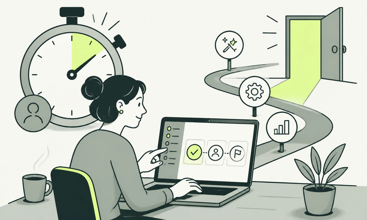
A new account signs in for the first time. The product shows a dashboard with no data in it, a tour that begins by pointing at the navigation, and a checklist with seven items on it. Nine minutes later the tab is closed. The only thing that actually happened is that a row appeared in your signups table.
That session was the whole trial. Most SaaS onboarding is designed forwards, from the signup form outwards: collect the account, confirm the email, ask the profile questions, run the tour. Designed backwards it looks entirely different. You name the single action that predicts a second session, and then you remove everything sitting between a new account and that action.
Ten minutes is not a target anybody should be proud of hitting. It is roughly the attention a working adult gives a product they signed up for between two other things, and you are spending that budget whether or not you have decided how.
One assumption before the argument: the product exists and somebody has already decided to try it. Getting them to that point is a different job, and if the software is not built yet the site has to carry the whole case on its own, which we covered in what a SaaS website needs before the product is ready.
Start from the activation event, not the signup form
Activation is not signup, and it is not the aha moment as described in a workshop. It is the first action a new account takes that reliably comes before them returning. For a project tool it might be a second person invited into a shared board. For an analytics product it is a first real data source connected. For a writing tool it is a document containing the user’s own words, saved.
The phrase doing the work in all three examples is their own. Watching a demo is not activation. Clicking through a tour is not activation. Something has to exist inside the account that would be mildly annoying to lose.
How to name yours
You do not need a data team for this. You need three conversations and one sentence.
- Ask the accounts that stayed what they did in week one. Not what they liked about the product. What they actually did, in order, and what they were trying to finish that day.
- Ask support which question arrives second. The first question is always about pricing or logging in. The second one usually sits exactly at the point where value starts and the product stops explaining itself.
- Find the action after which leaving becomes inconvenient. Data imported, a teammate invited, a workflow connected. Inconvenience to leave is a rough but honest proxy for value received.
- Write it as a sentence with a subject and a verb. "Connected one real data source" beats "experienced the value of the platform", because only one of them can be observed on a Tuesday.
Ten minutes is a budget, so spend it deliberately
Every screen inside that window is either moving the account towards the activation event or spending budget on something else. Profile questions, tours, plan selection and permission prompts are all real needs. They are simply not first-session needs.
| Minute | What the product should be doing | What it should not be asking for |
|---|---|---|
| 0 to 1 | Getting them signed in, into a workspace that already exists | Company size, job title, how they heard about you |
| 1 to 3 | Showing a screen with something recognisable in it | A blank canvas and a Create your first project button |
| 3 to 6 | Doing one piece of setup for them, visibly | A settings tour, or a choice between five templates |
| 6 to 9 | Getting one real thing of theirs into the product | Payment details, or an invite-your-team gate |
| 9 to 10 | Making the next session obvious and worth returning for | A satisfaction survey or a request for a review |
The table is a shape, not a prescription. What matters is that somebody decided where the minutes go, because the alternative is that the minutes get allocated by whichever team shipped most recently.
Signup counts rise when you shorten a form, and they stay high while the product fails everybody who completes it. Report first-session activation instead: of the accounts created this week, how many reached the action you named. It is a smaller and far less flattering number, and it only moves when something real gets fixed.
Defaults are the cheapest onboarding you can ship
Before anybody writes a tour, spend the same effort on defaults. A tour explains a decision. A default removes it. Only one of those makes the product shorter.
Most first-run friction is a sequence of choices presented to somebody with no basis for choosing. Which template. Which timezone. Which notification schedule. Which permissions model. A brand-new account has no opinion on any of it, and asking is not respectful; it is an abdication. The product design job is to pick a defensible answer, apply it, and make it visibly changeable later.
Every setting you can default away is a screen you can delete. Two rules keep that honest. Show what was chosen rather than hiding it, so nobody is surprised in week three. And keep the reversal cheap, because a default that is expensive to undo is a decision you took on somebody’s behalf without asking.
Sample data, and why most of it is wrong
An empty product is hard to evaluate, so teams add sample data. Then they add it badly, and it does more damage than the emptiness did.
Bad sample data looks like a marketing screenshot: forty immaculate records, three fictional teammates, a chart that trends upwards. It tells a new account nothing about their own situation, and the first thing they have to do is delete it. You have made cleanup the opening task in your product.
Sample data works when it is obviously a sample, removable in one action, and shaped like the work the account actually does. One project rather than forty. Two records with plainly placeholder names. A view that demonstrates the mechanic instead of performing success.
The stronger version is not sample data at all. It is their data, in the smallest quantity that works. If you can ask for one URL, one file or one connected account and build the first view out of that, do it. A product that shows somebody their own material in the first few minutes has made an argument no fictional dataset can make.
The setup you can do for them
Some setup genuinely has to happen. The only question is who does it. Sort the work into three categories, in descending order of how hard you should push.
- Infer it. Timezone from the browser. Currency from the locale. Workspace name from the email domain. Language from the request header. None of these needs a question, and all of them are routinely asked as one.
- Ask once, then finish the rest yourself. One connected account, one uploaded file, one pasted address. From that, generate the workspace, the first project, the initial settings and a screen worth looking at.
- Leave it entirely. Billing, roles, integrations with systems nobody has mentioned, and anything needing an administrator the user has not spoken to yet.
The far end of the second category is a product that finishes the job rather than preparing it. A content workspace such as Acrosite generates the required files, commits them to GitHub and triggers the configured deployment, so a first session can end with something published instead of something saved as a draft. Whatever your product does, work out what its equivalent of published is, and whether a first session can plausibly reach it.
The import question
Import is the most valuable onboarding feature most products never finish. It is also the one teams half-build. A partial importer that brings across names but not relationships leaves an account holding a broken copy of their own data, which is worse than holding no copy at all.
If you cannot import faithfully, do not offer import. Offer a template shaped like their existing structure and let them paste into it. Honest and small beats ambitious and lossy, because the lossy version teaches somebody that your product cannot be trusted with their material.
The empty state is a design surface
Most products treat the empty state as an error condition to be escaped. It is the screen with the highest concentration of new users anywhere in the product, and it is usually the one nobody designed.
There are three of them, not one
- Nothing yet. A brand-new account. The job is to show what this screen looks like when it is working, and to offer exactly one way to begin.
- Nothing here. A filtered or scoped view with no results. The job is to explain the filter and offer a way back. A Create your first project button on a filtered list is a bug, not a prompt.
- Nothing left. Everything done, archived or dismissed. The job is to confirm the state and point at what happens next, because this one is a success rather than a gap.
These are components, not one-off illustrations, which is one of the more honest arguments for a design system when you actually need one. Empty, error and loading are the three families that get reinvented on every screen until somebody names them once.
Two things are worth checking on the first screen specifically, because everybody sees it. It has to render quickly on an ordinary connection, and it has to stay responsive while setup work runs behind it. Core Web Vitals gives you the vocabulary, and interaction responsiveness is the measure that suffers when a first session kicks off a heavy import. Every form on that path also needs a real label, a visible focus state and an error message that says what to do next, which is ordinary WCAG 2.2 work rather than a nicety.
What to postpone, and where it goes instead
Postponing is not deleting. Everything you cut from the first session has to reappear at a moment when it is welcome, or it becomes a support ticket with your name on it.
Profile questions belong at the point where they change something visible. Asking for team size on screen two produces a guess. Asking when somebody invites a second person produces an answer, and the answer is worth having.
The tour belongs in the second session or nowhere at all. The plan choice belongs at the boundary where a limit is reached. The rest of the education belongs in lifecycle email, triggered by what the account did rather than by how many days have passed since signup. A sequence that congratulates somebody on creating their first project three days after they created it is a sequence nobody wired to the product.
The depth belongs in documentation people can reach without logging in, which quietly does more acquisition work than most teams credit it for. We made that case separately in documentation as a growth channel.
When a fast first session is the wrong goal
The honest limit. Some products cannot be evaluated in ten minutes, and pretending otherwise produces a demo rather than an onboarding.
If your product replaces a system of record, the first session has a different job: establishing that migration is possible and safe, not delivering value. If nothing can be connected without an administrator’s approval, the first session belongs to somebody who is neither the buyer nor the user and cannot activate anything. And if the thing is genuinely a service with software attached, the first ten minutes might correctly be a conversation.
That distinction is worth settling before you design anything, because the shape of a first session follows from what the thing actually is. Our parent company put the question plainly in product, service, or feature, and the related trap of building your way out of a positioning problem is set out in when a feature request is really a positioning problem.
Even in those cases the principle survives in a weaker form. Name the first thing that has to be true for a second session to happen, and design towards it. It might be a booked call rather than a connected data source. It is still the thing to work backwards from.
What we would ship first
If you have one week, do not redesign onboarding. Watch three first sessions instead, unedited, without helping. Screen recordings are acceptable; sitting quietly behind somebody is better. You will find the dead minute in the first session, and the internal argument about it will stop that afternoon.
Then close the single largest gap between signup and the action you named, and ship only that. Onboarding improves the way product improvement generally does: one removed step at a time, measured against a number you were previously too optimistic about. If you are still pre-launch, the same thinking shapes the product launch sequence, and the first ten minutes is much easier to design before the product has accumulated settings.
The rule worth keeping is this one. If a new account can reach the action you named without reading anything, the onboarding is finished. If they need a tour to get there, the tour is covering for a design decision nobody wanted to make. Show us your first session and how many accounts are still there at minute ten.
Common questions.
What is an activation event in SaaS onboarding?
An activation event is the first action a new account takes that reliably precedes them returning. It is not signup and it is not a completed tour. Common examples include connecting a real data source, inviting a second person, or saving a document containing words the user wrote themselves. The test is whether something now exists in the account that would be inconvenient to lose.
How long should a first onboarding session take?
Design the first session for roughly ten minutes, because that is about the attention a working adult gives a product they signed up for between other tasks. The exact number matters less than the discipline it enforces. With a fixed budget, every profile question, tour step and plan choice has to justify itself against the one action you want the account to reach.
Should onboarding use sample data or an empty state?
Use sample data only when it is clearly a sample, removable in one action, and shaped like the work the account really does. A polished fictional dataset makes deletion the first task inside your product. The stronger option is a small amount of material the account already owns, obtained from one address, file or connected account, so the first screen shows something they recognise.
What should a signup flow avoid asking for?
Avoid anything that does not change what the user sees next: company size, job title, how they heard about you, payment details, and invitations to teammates. Those questions produce guesses when asked early and useful answers when asked at the moment they matter. Infer what you can from the browser and the email domain rather than asking for it.
How do you design a good empty state?
Design three of them, because they are genuinely different screens. A brand-new account needs to see what the working version looks like plus one way to begin. A filtered view with no results needs an explanation of the filter rather than a create button. A cleared list needs confirmation that the state is a success and a pointer to what comes next.
How do you measure whether onboarding is working?
Measure first-session activation: of the accounts created in a period, how many reached the action you named. Signup counts rise whenever a form gets shorter and stay high while the product fails everyone who completes it, so they hide the problem rather than reveal it. Watching three unedited first sessions usually locates the wasted minutes faster than any dashboard.
Facing this in your
own business?
Tell us where you’re headed — we’ll map the shortest honest route.