

Identity as a System, Not a Logo File
A brand identity system is not a folder of artwork. It is a set of named values and rules that answer the design questions nobody thinks to ask, on the pages nobody will ever design.
On This Page
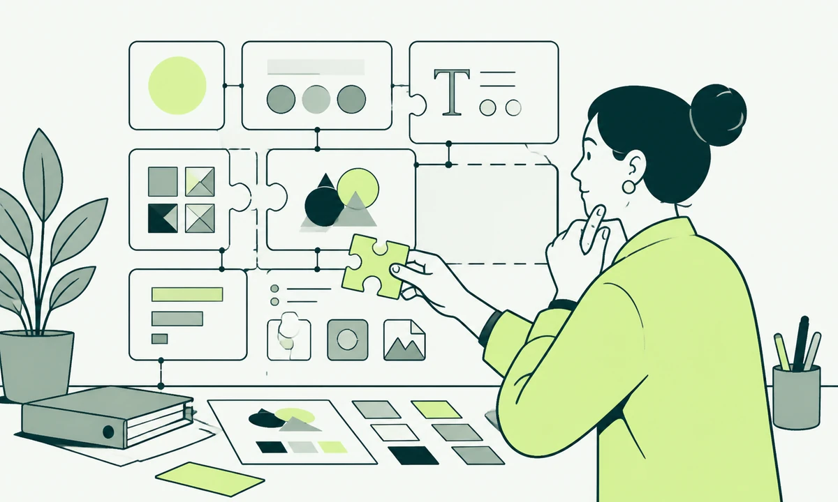
The delivery arrives as a folder. Logo in five formats, a colour palette with hex values, two typefaces, a set of example applications, and a document explaining the thinking. Everybody is pleased, and rightly so, because the work is usually good. Six weeks later somebody in sales needs a slide with a dark background, somebody in support needs an error message that looks like it belongs, and a developer needs a border colour for a disabled field. None of those exist in the folder. All three get invented, separately, on a Thursday.
That is the difference between artwork and a system, and it is the whole argument here. A brand identity system is not a nicer folder or a longer document. It is a set of named values, plus rules about how they combine, plus defaults that make the decision when nobody senior is available. Artwork answers the questions you asked during the project. A system answers the ones that turn up afterwards, forever, from people who were not in the room.
Most identity work still ships as the first thing. Not through carelessness: the artwork is what the brief asked for and what the presentation showed. But the artwork is the visible tip of a much duller deliverable, and the duller deliverable is what determines whether the brand still looks like itself in the second year.
What makes an identity a system
Three parts, and they are separable. Skip any one of them and the other two degrade quickly.
Tokens: values with names and jobs
A token is a value with a name that describes its job rather than its appearance. Not "the dark blue" but the surface colour for elevated panels. Not "24 pixels" but the space between a heading and the block underneath it. The naming is the entire trick, because a name that describes appearance stops being true the moment the appearance changes, and then you own a colour called brand-blue that is green.
A workable set is smaller than people expect: colour roles, a type scale, a spacing scale, border radii, border weights, and a small number of elevation steps. What matters is that the set is closed. If a designer can reach for a value outside it without anybody noticing, the tokens are a suggestion, and suggestions do not survive a busy quarter.
Rules: what may be combined with what
Values alone still permit an unreadable page. The rules are the pairings: which text colour goes on which surface, which type step is allowed at which level, how much space sits around the mark, which two typefaces may appear in one block, and what happens when a background is a photograph rather than a colour. Rules are where accessibility stops being a separate workstream, because a colour pairing that meets contrast requirements is a pairing rather than a checkpoint. Publish the permitted pairs and the failure becomes impossible instead of merely discouraged.
Defaults: the decisions the system makes
This is the part that gets left out, and the part that does most of the work. A default is what happens when nobody chooses: the heading size on a page nobody designed, the button style when the person building it does not know there are three, the image treatment when a photograph is missing. Good defaults mean the unattended page still looks like the brand. Every identity has far more unattended pages than designed ones, and the ratio only worsens as an organisation grows.
The questions that separate artwork from a system
These arrive within a month of launch, in roughly this order, from people with no interest in brand theory who simply need to finish something before the end of the day.
| The question that comes up | What a folder of artwork answers | What a system answers |
|---|---|---|
| A card on a dark background | Nothing. Ask the designer | The dark surface role and the text colour paired with it |
| A data table with more columns than fit | Nothing | The dense type step, the border weight, the row rhythm |
| An error message | The red from the palette, probably | The named danger role, its background pair and its icon |
| A partner logo beside yours | Rarely covered | Clear space in a stated unit, plus one lockup rule |
| A social post written at midnight | The template, if one exists | Which two type sizes exist and which is for this |
| A third-party widget you cannot restyle | Live with it | The nearest permitted values and who approves the gap |
Read down the middle column and the pattern is hard to miss. Artwork answers questions about the mark and stays silent about everything the mark sits next to, which is most of what anybody actually looks at.
What breaks when identity ships as artwork
The failure is never dramatic. Nobody wakes up and abandons the brand. It erodes one reasonable decision at a time, and every one of those decisions was defensible when it was made.
- Drift by a hundred small choices. Somebody needs a lighter blue for a hover state and picks one. Six months later there are nine blues, all of them nearly the same, none of them named.
- Every new surface becomes a request. A design team that should be solving new problems spends its week answering questions the system should have answered, and becomes a bottleneck it never asked to be.
- Accessibility turns into a retrofit. Contrast failures show up in an audit rather than in the palette, which means fixing them changes pages people have already signed off.
- Two teams build two of everything. Marketing has one button, product has another, and neither knows the other exists until a customer moves between them and notices.
- The next redesign costs twice. With tokens, a visual refresh is a change to values. With artwork, it is a page-by-page rebuild, because nothing was ever expressed as a decision that could be revisited.
The last one is the expensive one, and it is why an identity project that stops at artwork tends to produce another identity project sooner than anybody planned. Our parent company traced what actually gets sold in that situation in what gets sold when a brand stops working, and the uncomfortable finding is that the second project is usually the same project, priced higher.
A brand is judged on the pages nobody designed. That is the only real test an identity system has to pass.
Where the system has to live
A system in a PDF is a description of a system. It lives in three places at once, and the discipline is that one of them is the source while the other two are generated from it or reconciled on a schedule somebody owns.
In code, as variables the website and the product both read. In the design tool, as styles and components carrying the same names, so a handover conversation is about intent rather than translation. And in whatever templates non-designers actually touch: the slide master, the email layout, the page builder. That third location is the one teams forget, and it is where most of the brand gets produced by volume. Choosing which of the three is the source is a decision to make deliberately, alongside the other things that should freeze before a website build begins.
There is a lighter version of the idea worth knowing about, because not every organisation needs a token pipeline. Assembling pages from structured, pre-styled widgets, as a product like Nichevio does for profile sites, moves the identity decisions into the widget instead of onto the person filling it in. The person chooses content. The system chooses type, spacing and colour. Same principle as tokens, arriving by a different route.
The smallest system worth shipping
None of this requires a large programme, and starting with a component library is the common way to spend six months and still have no answers. If you have a week, decide six things and write them where people work.
- A closed colour set with roles rather than names: page, surface, ink, muted ink, accent, danger. Plus the permitted text-on-surface pairs, listed explicitly.
- Three type steps and a stated default, so the person who does not know which to use still picks the right one.
- One spacing unit and the multiples allowed. Two consecutive multiples that look almost identical is one multiple too many.
- One border weight and one radius. If a second is genuinely needed later, adding it is a decision somebody makes rather than a habit that appears.
- What happens when there is no image, because there will be no image far more often than the presentation suggested.
- The name of the person who answers everything not covered above, and how long they take.
That set answers most of the table above, fits on one screen, and can be built into a template the same week it is agreed. Everything else (motion, illustration rules, iconography weights, a documented component inventory) is worth having and can wait until the basic decisions have stopped being re-litigated on every project.
Handing it to people who are not designers
Most brand work is applied by people with no design training and no time: an account manager building a proposal, a developer adding a page, a founder writing a post at the airport. The system either helps them or gets bypassed, and there is no third outcome. Six things decide which.
- Name things by job, never by appearance. Surface, muted text, danger, emphasis. Somebody who cannot tell two greys apart can still tell which one is for a caption.
- Give defaults instead of options. Three heading sizes, not a scale of nine. Two button styles, not five. Every option you offer is a decision handed to somebody who did not want it.
- Put the rules where the work happens. Inside the template, the component, the page builder. A rule that requires opening a separate document to obey is a rule with an opt-out.
- Show the wrong version beside the right one. People recognise errors far faster than they absorb principles, which is the argument in full behind writing guidelines people actually follow.
- Name one person who answers exceptions. With a response time attached. An exception path that takes a week produces an unauthorised decision on day two, and that decision becomes precedent.
- Write down what may be broken. A system with no permitted exceptions is one people learn to route around quietly. Say which rules bend, for what, and who gets told afterwards.
Give the system to somebody who joined last week and ask them to build a page nobody has designed: a pricing table, a job posting, a maintenance notice. Watch without helping. Every question they have to ask out loud is a decision the system failed to make. Two questions is a good system. Six means you shipped artwork with a document attached.
What a system cannot do, and where that hurts
The honest limitation: a system produces consistency, and consistency is not distinctiveness. Push it far enough and every page becomes correct, safe and forgettable. That is a real cost, and it lands hardest on campaign work, where the point is to be noticed rather than to match. The answer is not fewer rules. It is a stated exception path with a named approver and an end date, so a campaign departs on purpose and comes back, rather than quietly starting a second visual identity nobody agreed to.
A system also cannot supply judgement about tone, which is why the verbal side needs the same treatment and the same discipline. Rules about colour will not stop two teams describing the company differently, and that inconsistency does more damage than a wrong grey, because messaging people can repeat is what a listener carries away from a conversation you were never part of.
And there is a scale below which all of this is overhead. A two-person company with one website does not need a token pipeline, a governance model or an exception process. It needs a short page of decisions, applied consistently by the two people making them. The system starts earning its cost when the number of people applying the brand exceeds the number who were in the room when it was designed.
Keeping the system alive after launch
Systems decay in a specific way: something new is needed, the system has no answer, the deadline wins, and the improvised answer becomes permanent because nobody went back. Prevent that with the least ceremony that works. One owner. A changelog with dates. A quarterly pass over whatever was improvised. And a short list of states the system has to define before anything ships, including the loading, empty and failure states that nobody mocks up and everybody eventually sees.
If you are commissioning identity work now, change one line in the brief. Ask for the values, the rules and the defaults as deliverables in their own right, named as such, alongside the marks. That single change is what separates visual identity that holds from artwork that has to be re-bought, and it is cheapest to ask for at the start, when it costs a conversation rather than a rebuild.
If the identity already exists as a folder, do not start again. Start by writing down the decisions that have already been made informally: the greys people keep reaching for, the heading sizes in use, the spacing that recurs. That inventory usually reveals a system somebody has been half-running for a year, and turning it into named values costs a fraction of a fresh brand launch. Then take it into the product, where the same tokens have to survive contact with interface design and the states no brand deck contains. If you want a read on how far your current identity would get in that test, show us the folder and the last three pages somebody built without asking a designer.
Common questions.
What is a brand identity system?
It is the set of named values, combination rules and defaults that let people apply a brand without a designer present. Values cover colour roles, type steps, spacing and borders. Rules cover which values may be paired. Defaults cover what happens when nobody chooses. A logo, a palette and a guidelines document describe a brand; a system is what produces consistent work at volume.
What are design tokens in branding?
Design tokens are brand values stored under names that describe their job rather than their look, such as a surface colour, a muted text colour or a spacing step. Because the name refers to purpose, the underlying value can change during a refresh without every reference becoming wrong. Tokens live in code and in the design tool under matching names, so both sides mean the same thing.
Why do brand guidelines get ignored?
Usually because they answer questions nobody asked while staying silent on the ones that come up daily, and because obeying them means opening a separate document. Rules applied inside the templates, components and page builders people already use get followed by default. Guidelines also fail when they offer many options instead of a few defaults, since every option is a decision handed to somebody who did not want it.
How small a company still needs an identity system?
The threshold is people, not revenue. A system earns its cost once more people apply the brand than were present when it was designed, because that is when decisions start being improvised in parallel. Below that, a short page of decisions applied consistently by the same two or three people does the job. Above it, informal knowledge stops transferring and drift becomes visible within months.
Does an identity system make everything look the same?
It can, if there is no route for deliberate exceptions. Consistency and distinctiveness are different goals, and campaign work in particular exists to be noticed rather than to blend in. The fix is a documented exception path with a named approver and a defined end, so a campaign departs on purpose and returns, instead of quietly becoming a second identity nobody agreed to.
Who should own a brand identity system after launch?
One named person, with the authority to approve exceptions and a stated response time. Ownership shared across a committee produces slow answers, and slow answers produce unauthorised decisions that harden into precedent. The owner keeps a dated changelog, runs a periodic pass over anything improvised under deadline, and decides what gets absorbed into the system and what gets rolled back.
Facing this in your
own business?
Tell us where you’re headed — we’ll map the shortest honest route.